
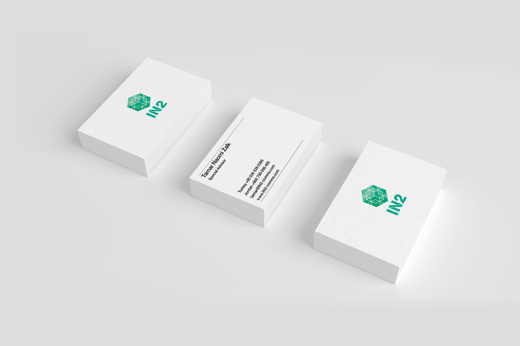
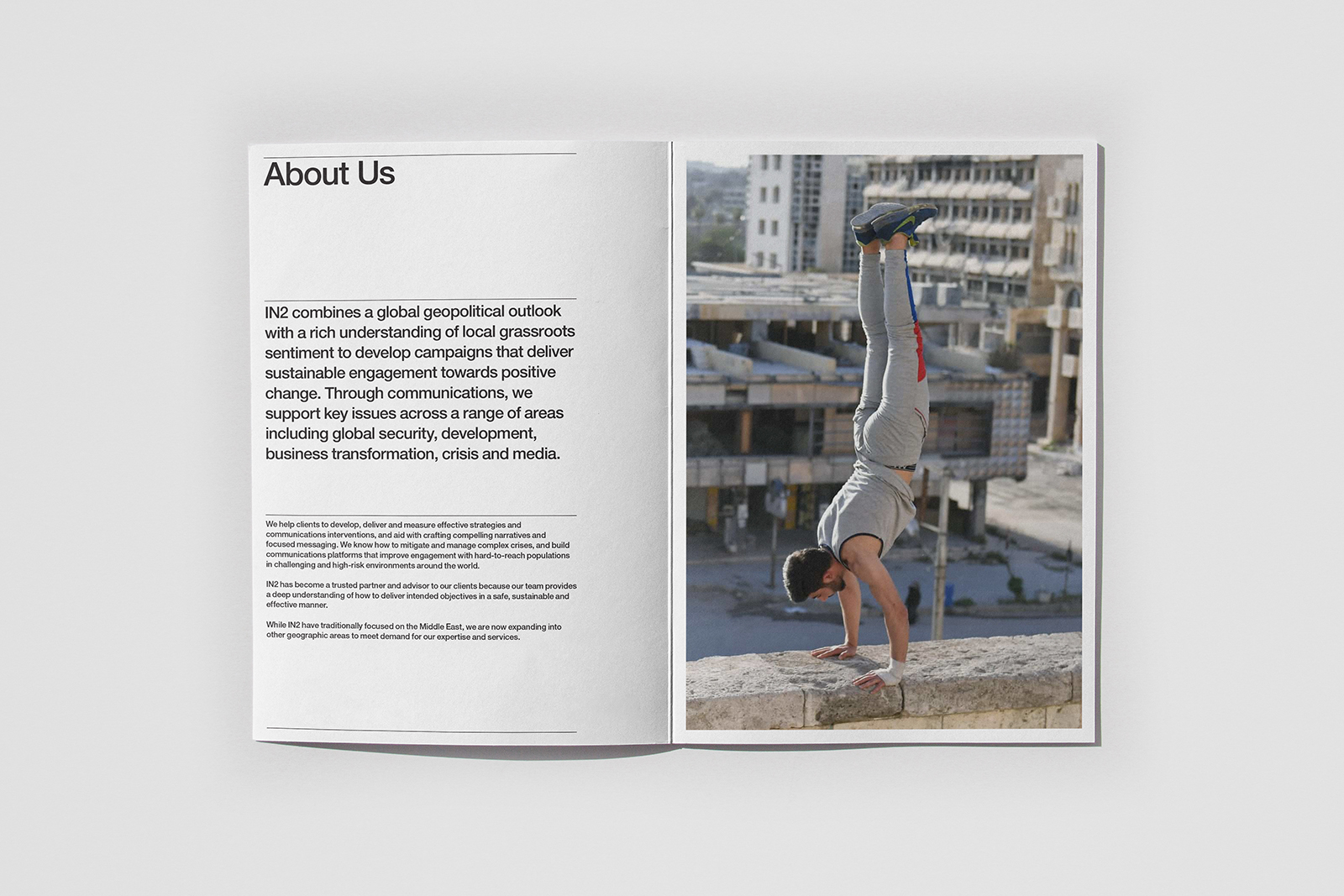
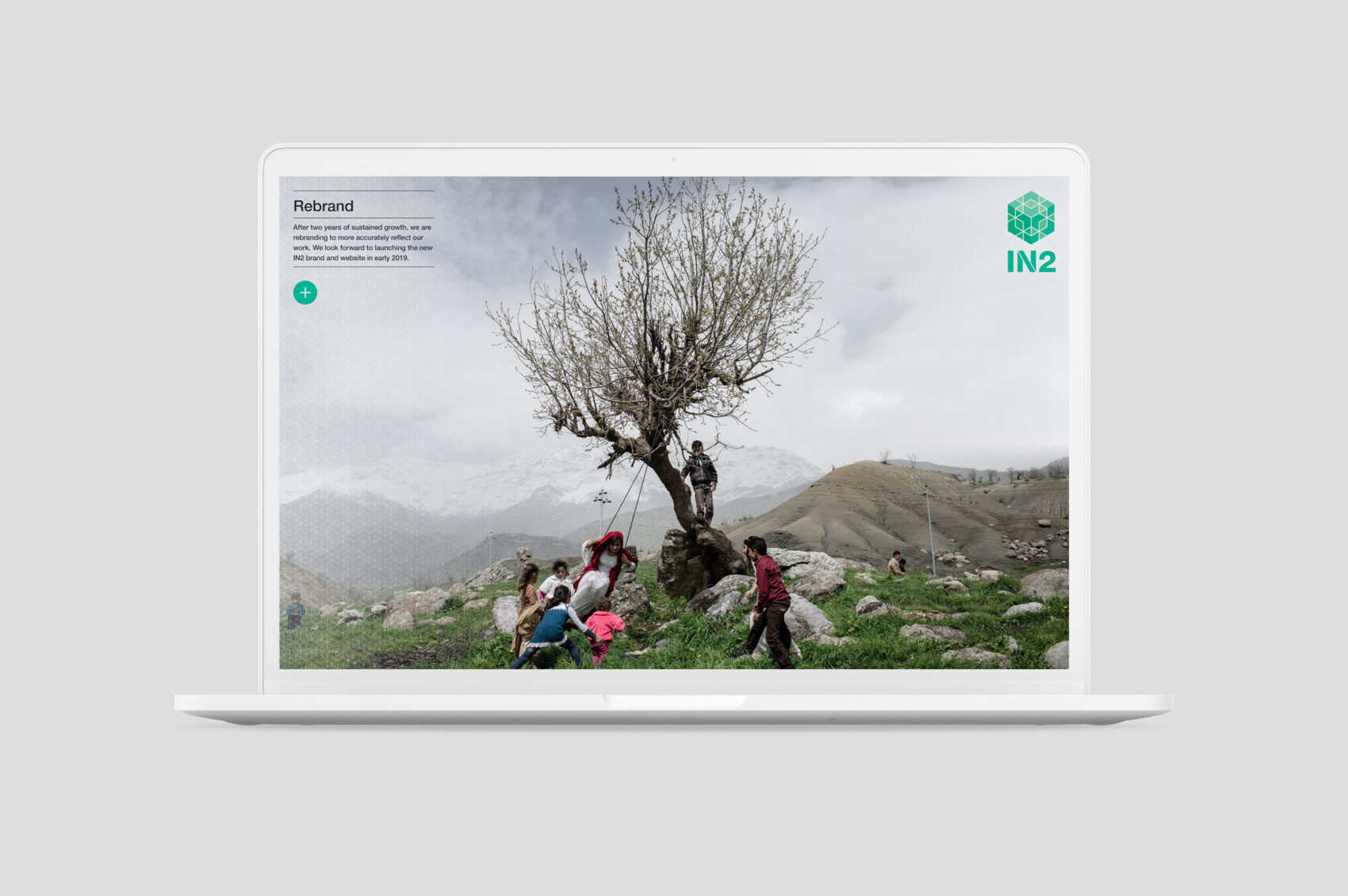
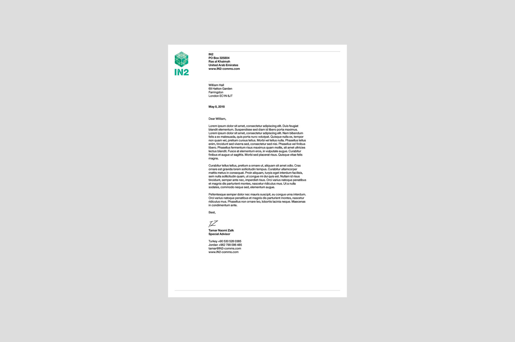
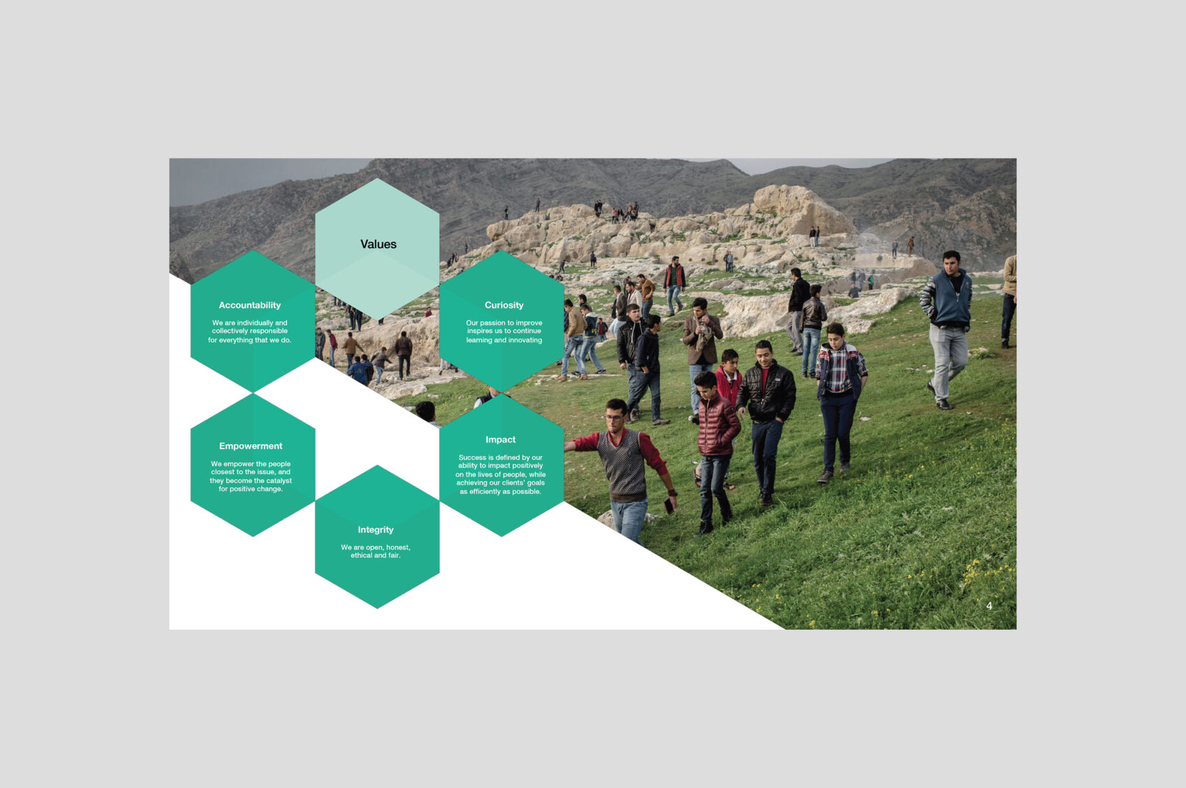
IN2 are a strategic communications company working in the Middle East, particularly Syria and Iraq. They create reports and organise community engagement, and we wanted to portray them as trustworthy, reliable and community-focused. They engaged us for a complete overhaul of their brand and all materials. IN2 were keen to use a green in their logo for its significance in Islam. We chose an idiosyncratic and contemporary shade, and I created a logo icon that echoed traditional Islamic geometric art, yet which contained a plethora of interlocking inwards and outward arrowheads, symbolising the conversations IN2 starts and engages in, and the networks they build. It was lent a 3D feel by varying opacities across the shapes, and the solidness of the cube that was implied suggested a robust and cohesive community. For the IN2 materials we used a simple combination of black, white and greens and shapes derived from the logo. We used lively, positive photography that avoided international aid cliches, and horizontal lines to delineate pages, organise information and provide consistency across media. Helvetica Neue Medium and Bold were used throughout for a uniform, solid and reliable appearance, and type hierarchies were simplified as far as possible to improve visual clarity. Shown here are various materials, from top: logo, business cards, brochure, holding page website, letterhead and slideshow. IN2 have retained the logo and templates, though have now redesigned their website to accord more directly with popular charity tropes.